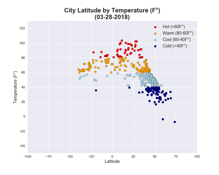
This chart plots each city's latitude compared to its temperature. The x-axis represents the latitude for each city, with 0 being the equator. Positive numbers go farther north on a map and negative numbers go farther south. The y-axis represents the temperature in degrees Fahrenheit. I grouped the temperature readings into four categories: cold (<40°), cool (40°-60°), warm (60°-80°) and hot (>80°).
As expected, the data shows that as you get closer to the equator, the temperature gets hotter. The amount of red dots, which represent cities with hot temperatures, are clearly located 25 degrees north or south of the equator (i.e., +/- 1,700 miles).