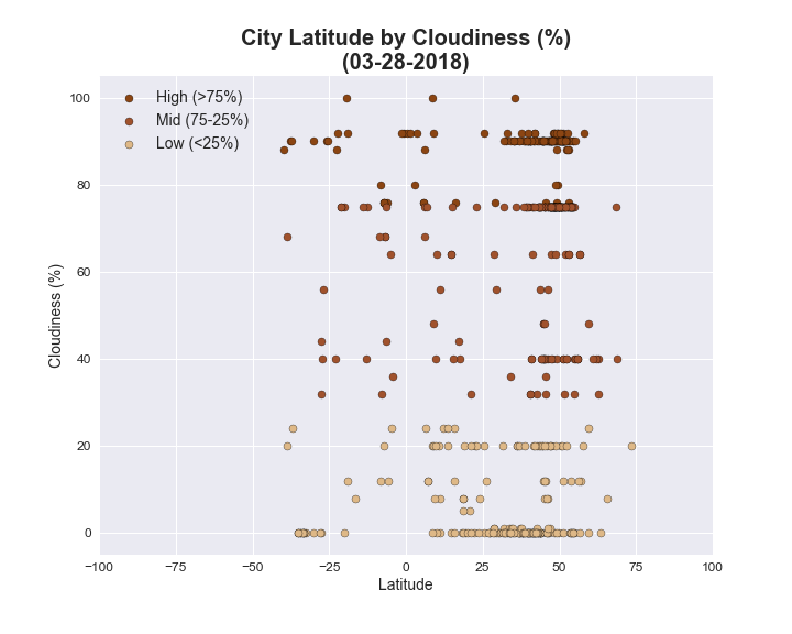
This chart plots each city's latitude by its cloudiness level. The x-axis represents the latitude for each city, with 0 being the equator. Positive numbers go farther north on a map and negative numbers go farther south. The y-axis represents the cloudiness percentage. The light brown circles are low levels of cloudiness (< 25%), the brown circles are medium levels of cloudiness (25-75%) and the dark brown circles are high levels of cloudiness (> 75%).
The data doesn't appear to show a relationship between location and cloudiness. There are cities with high levels of cloudiness and cities with low levels of cloudiness both near the equator and far away from the equator.